Sometimes, DIYing your real estate marketing materials is more practical (and more budget-friendly) than hiring an agency or freelancer. There are tons of tools and resources to allow even the most novice of designers create great flyers, Facebook ads, business cards, and more.
But there are also a million things that could go wrong.
To avoid disaster, follow these 7 rules for designing your own real estate marketing materials.
1) Use a design tool that does the hard part for you
 Unless you’re a skilled graphic designer, stay far away from Photoshop. It’s a complex software to learn, and it requires a lot of designing from scratch.
Instead, turn to one of the many DIY design tools available online. These tools provide professional-looking templates and layouts, so the hard part is already done—all you have to do is customize the design with your own words and images.
My favorite online design tool is Canva, which includes a huge library of free templates, layouts, typefaces, photos, and vector graphics. You can also upload your own images to use within Canva. You can easily design Facebook ads, presentations, letterheads, flyers, business cards, postcards, and more!
DesignBold is a similar tool that you might want to check out.
2) Check the usage rights of your images
Just because you found it in Google Image Search doesn’t mean you can use it. Images are property, and you can be fined for using an image without permission. If you can’t find the words Free for commercial use alongside an image you didn’t pay for, don’t use it.
Here are some options for getting images for your marketing materials:
- Use images from Pixabay—they are all free for commercial use and require no attribution. (There are just a few guidelines that you should review before proceeding.)
- Purchase stock photos from a website like Shutterstock, AdobeStock, or Depositphotos.
- Do an Advanced Image Search in Google to filter by usage rights (see instructions here).
- Take your own photos!
3) Ditch the phony stock photos
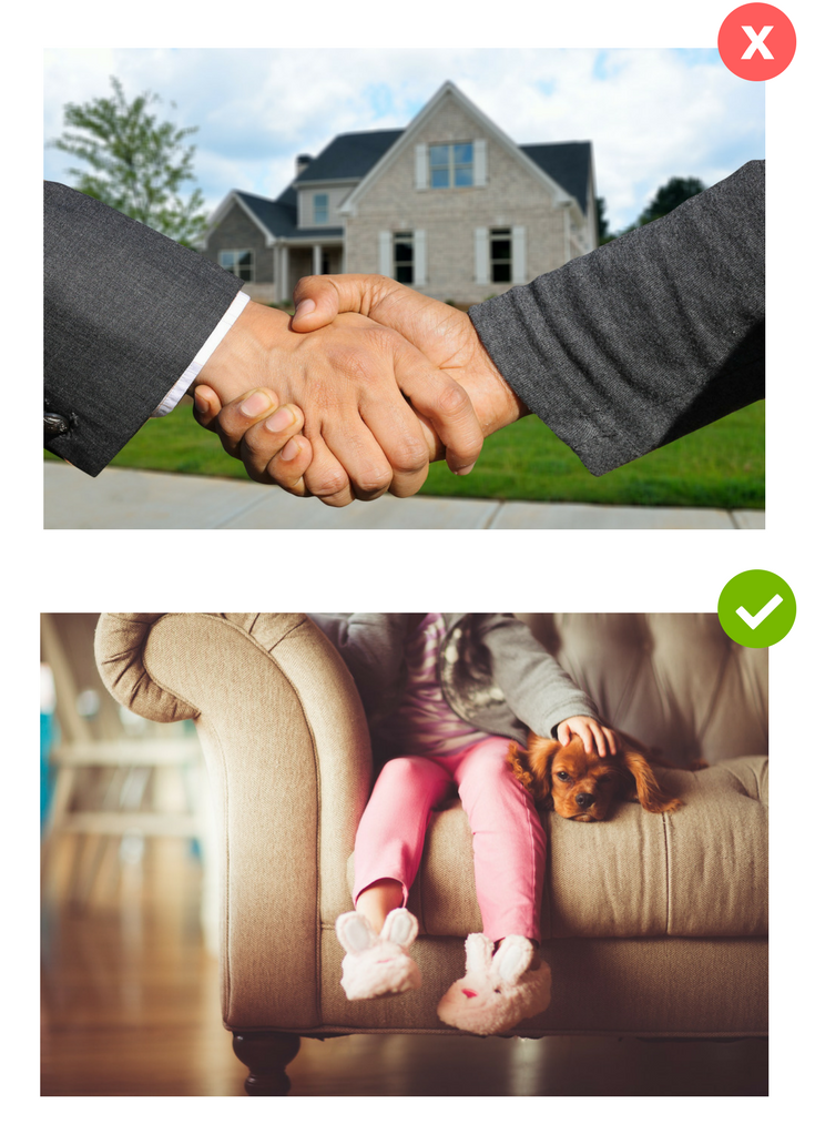
So…you need a nice, large-scale photo for your website’s home page? How about the classic beaming, besuited realtor handing key to happy, suspiciously modelesque couple in front of pristine row of houses?
Does that agent really work for your brokerage? Are those people really your clients?
I didn’t think so. Your prospective clients aren’t buying it, either.
Forgo the soulless stock photos in favor of images that look and feel real. If you aren’t able to use a great shot of one of your properties, there are plenty of stock photos out there that look more natural. Choose images that evoke emotion and feel authentic.
4) Choose font wisely
Typography is an important design element to consider. Here are some of the latest trends to keep in mind:
- Oversized type makes a big impact and puts your text front-and-center.
- Geometric fonts are popular these days—try using Montserrat or League Spartan.
- Handwritten fonts like Pacifico add flair to your messaging.
- For a more classic look, Libre Baskerville is a great serif font that looks professional but not boring (and it’s great for your body text, too).
- Avoid Papyrus at all costs.
The below invitation uses the typefaces Playlist Script and Lato.

5) Embrace color
Color is another design element that deserves some consideration. The current trend is bright and bold colors, so have some fun with it! Whether you go for a bright background color or a vibrant accent color, this is one way to make sure your marketing materials are looking fresh and engaging.
This postcard (made using a template in Canva) uses a bright blue accent color.

6) Be consistent.
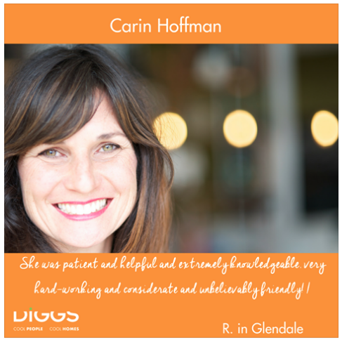
Once you find a particular design element you like, use it on everything. It might be your brand color (like Realvolve’s red) or a style (like DIGGS’s formula for testimonial images: high quality photo + orange color block + script font). This consistency will reinforce your brand in the minds of your audience.
7) Use the optimal image resolution, file types/sizes, and dimensions
Different mediums and platforms require different image specifications, so be sure to check before you start designing. Facebook ads, for instance, should be 1,200 x 628 pixels. But if you’re designing a flyer that you’ll print at Kinkos, you’ll want to create an 8 x 11 inch design saved as a PDF. Make sure you’re following the correct image specifications for whatever you are designing!
Here are a few general guidelines:
Image resolution:
- For images displaying on the web, minimum of 72 pixels per inch (ppi)
- For printed images, minimum of 300 ppi
File types:
(There are many other options, but these are the file types offered by Canva.)
- Web: PNG (supports transparency) or JPG
- Print: PDF
(There are many other options, but these are the file types offered by Canva.)
Optimal dimensions for images that will work across all social media sites:
(These dimensions are great for creating an image that you can post to your blog, then allow the image to be pulled into Facebook, Twitter, Instagram, and wherever else you share that blog post.)
- Horizontal images (landscape) – 1,024 x 512
- Vertical images (portrait) – 800 x 1,200
To DIY, or not to DIY?
Designing your marketing materials doesn’t just save money; it can also save time! When you DIY, you don’t have to go back and forth with a designer, providing feedback and asking for revisions. You are in control.
On the other hand, sometimes DIYing it backfires, and you end up spending way too much time tweaking and perfecting your designs. When design work starts cutting into your prospecting time…it’s just not working. You’re no longer saving time or money.
My advice? Start small. Design your own Facebook posts, or whip up a quick postcard, and track how much time it’s taking you (and how effective your DIYed marketing materials are performing). If it seems to be working, great! Go forth and design it all yourself!
And if not, it’s okay to hire a designer and stick to what you do best.
